Lumi
An emotion-tracking app designed to help users build emotional literacy and discover supportive next steps.
Project
Mobile Web App (Course Project)
Role
Entire product design from research to conception, visualization and testing
Timeframe
6 months
Tools
Figma, Lyssna, Miro, Claude

About the project
Lumi is an emotion-tracking app that helps users name what they're feeling, spot patterns and find strategies to cope - guided and focused, without adding to the noise of everyday life.
I explored this as part of CareerFoundry's UX/UI Design program, working through the full design process independently, from user research and information architecture to prototyping and usability testing.
The Problem Space
This gap shaped Lumi's direction: a calm, guided experience that balances low effort with meaningful insight.
From Research to Personas


Defining the main tasks


Creating the structure
I translated the flows into a sitemap and validated it through two rounds of card sorting. One unexpected finding shaped the structure: users clearly distinguished between active and passive content - exercises for doing, articles for learning. I had initially grouped them together, but the sorting results made separating them the obvious call.
Updating navigation labels
Functional names gave way to user language: "Explore" for articles, "My Emotions" for insights and patterns.

From Wireframes to Prototype
With the structure in place I started to sketch the core flows, built mid-fidelity wireframes, and created a clickable prototype - iterating on clarity, navigation, and interaction states.
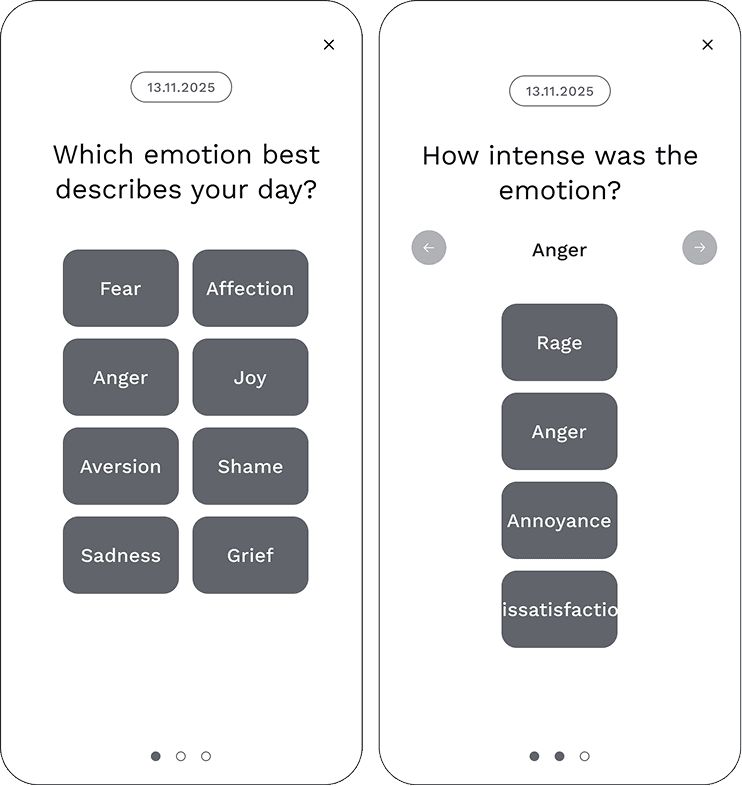
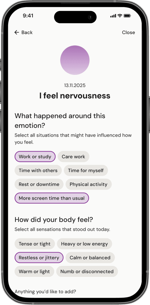
Shaping the emotion-tracking feature
The emotion tracking feature is based on Stavemann's Feeling Star, a framework from behavioural therapy. I translated the model into a flow that guides users from core emotions to nuanced intensity levels, helping them name what they're feeling more precisely.


Testing the solution
To validate the core flows and interactions, I conducted moderated usability tests with 6 participants using the mid-fidelity prototype. I synthesized findings in a Rainbow Spreadsheet and used Nielsen's severity scale to prioritize issues.
Tone and concept resonated but there was friction
The tone landed well, and participants moved through the app with ease. But testing surfaced friction in the details - around gestures, navigation cues, and copy - which drove targeted improvements to the tracking flow, confirmation screen, and microcopy.


Establishing Visual Design
Developing a visual direction
After validating Lumi's core flows with a grayscale prototype, I wanted to ensure the visual design supported emotional clarity without adding overwhelm. I ran a preference test comparing two approaches.
Most participants preferred the Soft direction, describing it as calmer and more approachable, so it became the foundation for the final UI.


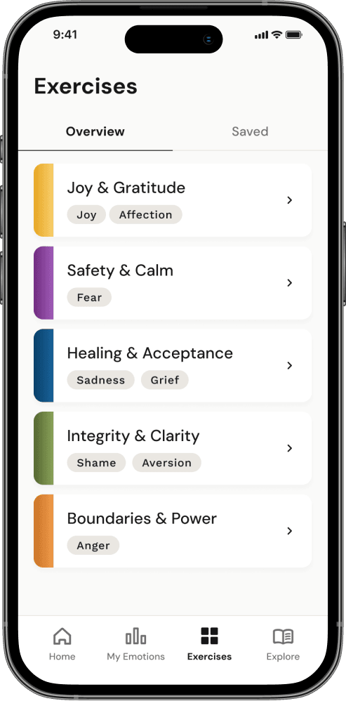
Lumi's core features - emotion tracking, My Emotions, and emotion-linked exercises and articles - work as one connected system. A consistent visual language helps users move between features without re-orienting, reinforcing emotional continuity rather than breaking it.


The Final Solution
Core flow 1
Adding an emotion entry


Core flow 2
Reviewing patterns


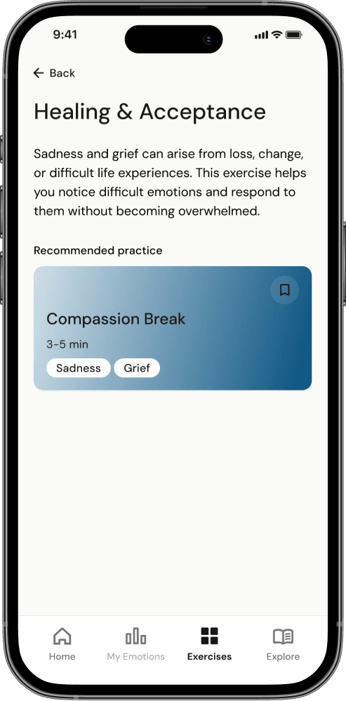
Core flow 3
Doing an exercise


Reflection
This project constantly challenged me to balance breadth with focus. Research opened up directions like privacy features or deeper personalisation, that were valuable findings but out of scope for an MVP. Deciding what not to build was as important as deciding what to include.
Research also challenged one of my core assumptions. I'd expected most users would struggle to name emotions - but I found a second group who were already emotionally literate, came with different motivations, and still shared the same need for frictionless tools. Their strong interest in educational content, combined with card sorting results, directly shaped the app's structure: what started as three core areas became four.
The UI phase also taught me something about my own working style. My structured approach led to a consistent colour system across all eight emotions - but it also meant I sometimes struggled to think more freely and exploratively. Visual design needs both, and finding that balance is something I want to keep developing.